Form Design Best Practices: Boost Conversions with Smarter Forms
Every day, potential customers land on your site ready to connect, only to be stopped by a poorly designed form. It's a silent conversion killer. In a world where every lead matters, a clunky, confusing, or untrustworthy form isn't just a minor inconvenience; it's a direct hit to your bottom line. Marketers spend immense effort driving traffic, but if the final step is broken, that investment is wasted. A form that fails to capture clean, actionable data is almost as bad as one that gets no submissions at all.
This guide cuts through the technical jargon to give you a clear, actionable roundup of the top 10 form design best practices. We'll cover everything from simple layouts and smart validation to the critical, often-missed strategies for capturing complete attribution data, like UTM parameters, directly in your CRM. To accurately diagnose these conversion barriers and pinpoint exactly why your forms are underperforming, a comprehensive SaaS UX audit can be incredibly insightful. By implementing the following tips, you won't just build better forms; you'll create a more efficient and profitable lead generation engine that reliably tells you where your best leads come from.
1. Single-Column Layout Design
One of the most impactful yet simple form design best practices is adopting a single-column layout. This approach arranges all form fields vertically in one line, guiding the user’s eye down a single, predictable path. Multi-column layouts often cause confusion, as users may skip fields or fill them out in the wrong order, leading to errors and frustration. A single column creates a clear, straightforward journey from start to finish.
This layout is foundational for mobile responsiveness, ensuring a consistent and user-friendly experience across all devices. For marketers using tools like LeadPulse or Attributer to capture leads from various sources like paid ads or organic search, a single-column design guarantees that the form works seamlessly whether a user is on a desktop or a smartphone.

Why It Works
A single column reduces cognitive load. Users don't have to think about where to go next; the path is laid out for them. This streamlined process leads to faster completion times and higher conversion rates. Leading form builders like Typeform and HubSpot use single-column layouts as their default because they are proven to perform better, especially on mobile devices where screen space is limited.
How to Implement It
Most modern form builders and website platforms make this easy.
- WordPress: Tools like Gravity Forms offer responsive templates that automatically stack fields into a single column on smaller screens.
- Webflow: The native form components are designed to be easily styled into a single vertical layout.
- HubSpot: Their embedded forms are single-column by default, prioritizing a clean user experience.
When building your form, simply drag and drop fields one below the other instead of placing them side-by-side. Ensure there is adequate spacing between each field to avoid a cluttered look, and keep field widths consistent for a polished, professional appearance.
2. Smart Field Validation & Error Handling
One of the most crucial form design best practices is implementing smart, real-time field validation. This technique checks a user's input as they type and provides immediate, helpful feedback. Instead of making users wait until they hit "submit" to see a list of errors, inline validation guides them through the process, preventing mistakes and reducing friction. This ensures cleaner data enters your CRM from the start.
For marketers using tools like Attributer to track lead sources, accurate data is non-negotiable. Smart validation ensures that essential fields like email and phone numbers are correctly formatted, which is critical for matching attribution data to the right contact in your system. This proactive approach prevents invalid submissions and protects the integrity of your lead data.

Why It Works
Real-time validation reduces user frustration and form abandonment. By flagging errors instantly, it helps users correct them on the spot, making the form-filling process feel smoother and more interactive. Clear, friendly error messages like "Please enter a valid email address" are far more effective than a generic "Invalid input" after submission. This positive user experience directly translates to higher completion rates and better quality leads.
How to Implement It
Most modern platforms have built-in validation features that are easy to configure.
- Airtable: You can set input rules directly on form fields to enforce specific formats, such as ensuring an email field contains an "@" symbol.
- Gravity Forms: This WordPress plugin offers built-in validation for common field types like email, phone, and website URLs.
- Webflow: Its native form settings allow you to specify field types (e.g., Email, Phone) that automatically apply basic validation rules.
When setting up validation, be specific with your error messages. Always validate on the server-side for security, even if you use client-side validation for a better user experience. Be flexible with formats, allowing common variations like phone numbers with or without dashes, to avoid unnecessarily blocking valid entries.
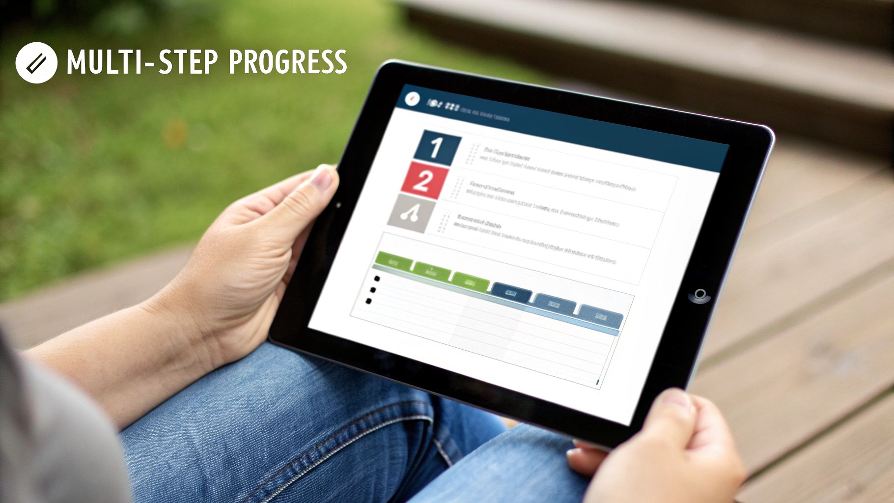
3. Progressive Disclosure & Multi-Step Forms
For longer forms, one of the most effective form design best practices is to use progressive disclosure, often implemented as a multi-step form. Instead of overwhelming users with a long list of fields at once, this technique breaks the form into smaller, logical chunks presented one step at a time. This reduces the initial cognitive load and makes the form feel less intimidating, which significantly boosts completion rates.
This approach is especially powerful for complex registrations or detailed lead qualification forms. By revealing fields progressively, you create a conversational flow that guides the user forward. For marketers focused on lead attribution, a multi-step design allows hidden fields capturing UTM parameters to persist across each step, ensuring that critical source data is captured without cluttering the user-facing interface.
Why It Works
Multi-step forms leverage the "foot-in-the-door" psychological principle. Once a user completes the first easy step, they are more committed to finishing the entire process. Showing a progress bar (e.g., "Step 2 of 4") reinforces this momentum and manages expectations. Tools like Typeform have built their entire platform on this conversational, step-by-step experience because it consistently converts better than traditional, long-form alternatives.
How to Implement It
Most form builders offer features to create multi-step or conditional forms.
- Gravity Forms: Use the "Page Break" field to split your form into multiple pages. You can also use its powerful conditional logic to show or hide fields based on previous answers.
- HubSpot: Progressive profiling allows you to swap out fields a user has already filled in with new ones on subsequent visits, progressively gathering more information over time.
- Typeform: This tool is inherently multi-step, presenting one question at a time to create a seamless, engaging experience.
When building, keep each step short, ideally with just 2-3 fields. Use clear and encouraging calls-to-action on each step, like "Continue" or "Next," to guide users to completion.
4. Strategic Field Minimization
One of the most effective form design best practices is to ask for only the absolute essential information. Strategic field minimization directly combats form abandonment by reducing the effort required from the user. Every extra field you add increases friction and gives potential leads a reason to leave. The goal is to capture just enough data to qualify and initiate a follow-up, nothing more.
This minimalist approach ensures faster submissions and cleaner data. For marketers using a tool like LeadPulse to capture attribution data, fewer fields mean a quicker, more reliable sync to your CRM. Great examples include Slack’s initial 3-field signup form or the 2-3 default fields in Facebook Lead Ads, both designed for maximum conversion by minimizing user effort.
Why It Works
Reducing the number of fields lowers the user's perceived effort and time commitment, making them more likely to complete the form. This principle is rooted in psychology; the less you ask, the more you receive. A shorter form feels less intrusive and respects the user’s time, which builds initial trust and significantly boosts completion rates. It focuses on starting a conversation rather than completing an interrogation.
How to Implement It
Implementing this practice requires a disciplined approach to what you ask for.
- Audit Your Fields: Analyze your CRM to see which fields your sales team actually uses for their initial outreach. If a field isn't critical for that first contact, remove it. To learn how to integrate essential form fields with your CRM, you can explore how to connect web forms to Pipedrive.
- Start Small: Begin with just the essentials: Name, Email, and perhaps Company Name for B2B. Move "nice-to-have" questions to a follow-up email or use progressive profiling in tools like HubSpot to gather more data over time.
- Clearly Mark Optional Fields: If you must include non-essential fields, label them as “(Optional).” This gives users control and prevents them from feeling forced to provide information they are not comfortable sharing.
5. Contextual Form Defaults & Pre-Population
One of the most effective form design best practices for reducing friction is to do the work for your users. Contextual pre-population uses available data to automatically fill in form fields, saving users time and effort. This can involve inferring a company from an email domain, detecting location from an IP address, or pulling profile data on platforms like LinkedIn. This not only improves the user experience but also increases data accuracy.
For marketers, this technique is crucial for attribution. Tools like Attributer can automatically capture UTM parameters from the URL and pre-populate hidden fields. This ensures that every lead is accurately tracked back to its original source, whether it's a paid ad or an organic search click, without requiring any manual input from the user or complex setups from the marketer.

Why It Works
Pre-populating fields makes the form feel smarter and less demanding, which significantly boosts completion rates. When a user sees their information already filled in, it creates a seamless, personalized experience. For attribution, automatically capturing UTM data in hidden fields is the most reliable way to ensure you know which marketing channels are driving conversions, providing clear ROI on your campaigns.
How to Implement It
Many tools are designed to make this process simple for non-technical marketers.
- Attribution: Use a tool like Attributer to automatically capture UTM parameters (source, medium, campaign) and other referral data in hidden fields. It integrates directly with form builders and CRMs.
- LinkedIn Lead Gen Forms: These forms automatically pull data from a user's LinkedIn profile, like their name, email, and company, making submissions incredibly easy.
- HubSpot: Its forms can use IP address data to suggest a user's country and can be configured to pre-fill fields for known contacts.
To start, add hidden fields to your form for utm_source, utm_medium, and utm_campaign. Use a dedicated tool or simple scripts to pull this data from the URL and populate the fields. Always test to ensure this data syncs correctly to your CRM like HubSpot or Pipedrive.
6. Clear & Accessible CTA (Call-to-Action) Design
The final step in your form is the submission button, and its design can make or break your conversion rate. A clear and accessible Call-to-Action (CTA) is visually prominent, uses action-oriented language, and is easy to click on any device. It acts as the final, persuasive nudge that transforms a visitor into a lead, making it a critical component of effective form design best practices.
A well-designed CTA ensures users complete the submission process, which is essential for capturing lead data. For marketers using tools like LeadPulse to connect form submissions with attribution data from tools like Attributer, a successful click on the CTA is what triggers the capture of crucial marketing insights. A weak CTA means lost leads and incomplete analytics.
Why It Works
A strong CTA reduces hesitation and provides clarity about what happens next. Vague labels like "Submit" or "Send" are uninspiring. In contrast, action-oriented text like "Get My Free Quote" sets clear expectations and aligns with the user's motivation. High-contrast colors make the button stand out, while an appropriate size ensures it’s easily tappable on mobile, improving the overall user experience and boosting submission rates.
How to Implement It
Designing an effective CTA is straightforward with modern tools.
- Use Action-Oriented Text: Replace generic labels with specific, value-driven copy. Instead of "Submit," use "Schedule a Demo" or "Claim My Consultation."
- Ensure Visual Prominence: Make the button's background color contrast with the page background by a ratio of at least 4.5:1 to meet accessibility standards.
- Optimize for Mobile: Design the button to be at least 44x44 pixels, the recommended minimum size for touch targets, preventing accidental taps.
- Position Intuitively: Place the CTA directly below the last form field in a single-column layout, creating a natural end-point for the user's journey.
By focusing on these details, you can significantly increase the likelihood that users will complete your form. For more tips on connecting your forms to tracking tools, you can learn more about tracking leads with any form builder.
7. Mobile-First & Responsive Design
With over half of all web traffic coming from mobile devices, designing forms with a mobile-first approach is no longer optional; it's essential. This practice involves creating your form for the smallest screen first and then scaling it up for larger devices. This ensures a seamless, functional, and user-friendly experience for every visitor, regardless of how they access your site.
A mobile-first strategy is crucial for accurate lead attribution. Marketers using tools like Attributer to capture UTM parameters need to ensure their forms work perfectly on mobile, as this is where a significant portion of paid and social traffic originates. A poorly optimized mobile form can fail to capture hidden fields, leading to incomplete data in your CRM and a blind spot in your marketing analytics.
Why It Works
A responsive, mobile-first design guarantees that your form is accessible and easy to use for the majority of your audience. This reduces friction, prevents user drop-off, and directly increases conversion rates. Platforms like Typeform excel because their core design is inherently mobile-friendly, providing a smooth, app-like experience that users enjoy. This focus on mobile usability is a key component of modern form design best practices.
How to Implement It
Most modern tools are built with mobile responsiveness in mind, but you should always verify the user experience.
- Gravity Forms: Use the built-in mobile preview feature to see how your form will look and function on smaller screens before publishing.
- Webflow: Leverage its powerful responsive design controls to style your form for different breakpoints, ensuring it looks great on every device.
- Test on Real Devices: Browser emulators are helpful, but nothing beats testing your form on actual iPhones and Android devices to catch real-world usability issues.
- Use Proper Input Types: Set field types like
type="tel"ortype="email"to trigger the correct mobile keyboard, making data entry faster and easier for users.
8. Trust Signals & Form Credibility Elements
Users are hesitant to share personal or business information online, and a form can feel like a significant barrier. Including trust signals and credibility elements directly on or near your form is one of the most effective form design best practices to ease this anxiety. These are visual and textual cues that reassure users their data is safe, the offer is legitimate, and their submission is a low-risk action. For B2B lead generation, this is especially crucial, as it builds immediate confidence.
When a user sees familiar security badges, testimonials, or a clear privacy statement, it answers their unspoken questions about data security and company legitimacy. This reduces friction and directly addresses potential objections before they arise, making users far more likely to complete the form. Tools like HubSpot and ConvertKit often incorporate these elements into their form builders because they demonstrably improve conversion rates.
Why It Works
Trust signals work by borrowing credibility from established, trusted third parties (like McAfee or Norton) or by using social proof (like customer logos and testimonials). This psychological shortcut helps users feel secure without needing to do extensive research on your company. A simple statement like "We'll never share your email" can be enough to overcome hesitation, making the user feel respected and in control.
How to Implement It
Integrating trust signals is straightforward and can be done without technical expertise.
- Privacy Statement: Add a short, clear sentence directly below the submit button. For example: "We respect your privacy. Your data is secure and will never be shared."
- Customer Logos: If you are a B2B company, feature the logos of 2-3 well-known clients near the form. This is easily done in most page builders like Webflow or Elementor for WordPress.
- Security Badges: If you process payments or handle sensitive data, add badges from your security provider (e.g., SSL certificate, Norton).
- Testimonials: Place a short quote from a happy customer near the form. Using their photo or avatar adds an extra layer of authenticity.
9. Form Labeling, Placeholder Text & Instructions
Clear and consistent labeling is a cornerstone of effective form design best practices. This involves using descriptive labels placed directly above each field, supplemented by helpful placeholder text and brief instructions where necessary. The goal is to eliminate ambiguity and guide users effortlessly through the form, ensuring they understand exactly what information is required for each field. Ambiguous labels like "Name" can lead to incomplete data, while clear labels like "Full Name" prevent errors.
Proper labeling is not just about user experience; it’s critical for accessibility and data quality. For marketers struggling with inconsistent lead data in their CRM, unclear fields are a common culprit. If users enter personal emails in a field meant for work emails, it skews segmentation and outreach efforts. Well-defined labels ensure the data you capture is clean and reliable from the moment it's submitted.
Why It Works
Clear labels reduce cognitive friction and prevent user errors. When users know precisely what to enter, they complete forms faster and with less frustration, boosting submission rates. Placing labels above the input field is the most user-friendly approach, as it remains visible even after the user starts typing. This practice is strongly recommended by usability experts and is a core principle of accessible design (WCAG), ensuring screen readers can correctly announce each field’s purpose.
How to Implement It
Most form builders give you full control over field labels and placeholder text.
- Placement: Always place labels above the input field. This positioning works best on both desktop and mobile and supports accessibility.
- Clarity: Use descriptive but concise labels. Instead of "Email," use "Work Email Address." Mark required fields with a clear asterisk (*).
- Placeholder Text: Use placeholders sparingly to show an example of the required format, such as
(123) 456-7890for a phone number. Never use it as a replacement for a label, as it disappears on input. - Accessibility: Ensure the
<label>element is programmatically linked to its corresponding<input>in the form’s HTML. Most modern form builders handle this automatically.
10. Form Analytics, Testing & Conversion Optimization
Even the most thoughtfully designed form can be improved. A crucial form design best practice is to systematically measure, test, and optimize its performance. This means going beyond just counting submissions and digging into user behavior to understand what's working and what isn't. Using analytics, you can uncover hidden friction points, like specific fields where users abandon the form, leading to higher completion rates.
For marketers, this data is invaluable. Tools like LeadPulse rely on form submissions to capture attribution data, so optimizing the form directly improves the quality of your lead source insights. By understanding which forms convert best, you can better analyze which marketing channels, like paid search or social media, are truly driving valuable leads.
Why It Works
Analytics removes guesswork from form design. Instead of relying on intuition, you can make data-driven decisions. Heatmaps from tools like Hotjar show where users click and how far they scroll, while session recordings reveal real-time struggles. A/B testing platforms like VWO allow you to test changes to a single element, such as a button color or field label, to see its direct impact on conversions. This continuous improvement cycle leads to more leads and better data.
How to Implement It
Start by setting up conversion tracking to measure submission rates.
- Google Analytics 4: Set up an event to track every successful form submission. You can learn more about how to do this in our guide to tracking form conversions in Google Analytics.
- Heatmap Tools: Install a tool like Hotjar or Crazy Egg to visually analyze user interactions and identify drop-off points.
- CRM Analytics: Platforms like HubSpot and Pipedrive have built-in form analytics that show views, submission rates, and conversions by traffic source.
When testing, change only one element at a time and run the test long enough to gather meaningful data, typically for at least one to two weeks. Track which fields cause the most drop-offs and test different versions to reduce friction.
Form Design: 10 Best-Practices Comparison
| Item | Implementation Complexity 🔄 | Resource Requirements 💡 | Expected Outcomes 📊⭐ | Ideal Use Cases 💡 | Key Advantages ⚡ |
|---|---|---|---|---|---|
| Single-Column Layout Design | Low 🔄 | Minor CSS/layout work; mobile testing | 📊↑ mobile completion; ⭐⭐ | Mobile-first traffic, 5+ field forms | Faster submissions; consistent UX across devices ⚡ |
| Smart Field Validation & Error Handling | Medium-High 🔄🔄 | Dev for client/server validation, UX copy | 📊↑ data quality; ⭐⭐⭐ | CRM-reliant workflows, email/phone critical forms | Prevents invalid leads; reduces support & cleanup ⚡ |
| Progressive Disclosure & Multi-Step Forms | High 🔄🔄🔄 | Multi-step logic, state persistence, UX design | 📊↓ perceived length, ↑ completion; ⭐⭐⭐ | Long qualification flows, gated content, complex forms | Better qualification; lowers abandonment over long forms ⚡ |
| Strategic Field Minimization | Low-Medium 🔄🔄 | Analytics to decide fields; CRM alignment | 📊↑ conversions (25%+); ⭐⭐⭐ | High-abandonment forms, initial signups | Higher completion; cleaner, faster CRM sync ⚡ |
| Contextual Form Defaults & Pre-Population | Medium-High 🔄🔄🔄 | Backend/JS integrations, privacy checks | 📊↑ accuracy & attribution; ⭐⭐⭐ | Returning users, B2B with work emails, UTM-dependent leads | Reduces typing; preserves UTM/source data for attribution ⚡ |
| Clear & Accessible CTA Design | Low 🔄 | Design/copy tests, accessibility checks | 📊↑ submission rates; ⭐⭐⭐ | Any form — especially low-commit CTAs | More submissions; better accessibility and clarity ⚡ |
| Mobile-First & Responsive Design | Medium 🔄🔄 | Responsive build, performance testing on devices | 📊↑ mobile completion; ⭐⭐⭐ | Mobile-heavy audiences, PPC & landing pages | Captures mobile leads reliably; improves SEO/UX ⚡ |
| Trust Signals & Form Credibility Elements | Low-Medium 🔄🔄 | Content collection (testimonials), legal review | 📊↑ trust-driven conversions (~10–20%); ⭐⭐ | B2B, finance, health, privacy-sensitive industries | Reduces abandonment due to trust/privacy concerns ⚡ |
| Form Labeling, Placeholder Text & Instructions | Low 🔄 | Copywriting and accessibility testing | 📊↓ errors; ↑ data quality; ⭐⭐ | Complex inputs, accessibility-focused forms | Fewer mistakes; improved screen-reader compatibility ⚡ |
| Form Analytics, Testing & Conversion Optimization | Medium-High 🔄🔄🔄 | Analytics tools, A/B testing, analyst time | 📊↑ conversion via tweaks (10–30%+); ⭐⭐⭐ | Mature marketing stacks, CRO programs, attribution analysis | Identifies friction; data-driven ROI improvements ⚡ |
Transform Your Forms from Lead Blockers to Conversion Magnets
We've covered a lot of ground, moving from high-level layout choices to the granular details of field validation and call-to-action design. It’s clear that a form is far more than just a box for collecting information. It’s a critical handshake with your potential customer, a pivotal moment where interest can either convert into a valuable lead or evaporate due to friction and frustration.
Adopting these form design best practices isn't about a one-time, massive overhaul. It's about making a series of strategic, user-centric improvements. Start by simplifying your layout to a single column, which instantly improves readability. Then, critically review every field you ask for and remove anything that isn't absolutely essential for the initial conversation. A shorter form is almost always a higher-converting form.
The Real Impact of Small Changes
Remember, the goal is to create a seamless, intuitive, and trustworthy experience. Smart error messages guide users instead of scolding them. Clear, accessible labels eliminate guesswork. And incorporating trust signals like privacy policy links or testimonials assures users that their information is safe. Each of these practices contributes to a larger whole, building a form that feels less like a chore and more like a simple, helpful step.
Ultimately, your form is the final gateway in your lead generation funnel. To truly transform forms into conversion magnets, it's essential to understand how form design fits into broader web design best practices for conversions that enhance user experience and drive sales. A well-designed form on a poorly designed page will still struggle to perform.
From Good Design to Great Data
Beyond just increasing submission rates, a great form delivers clean, actionable data directly into your CRM. This is where the magic truly happens. By implementing hidden fields to capture UTM parameters and other attribution data, you finally get answers to the most important marketing question: "Where are my best leads coming from?"
This isn't just a "nice-to-have" insight. It’s the data that empowers you to double down on what’s working, cut spending on what isn’t, and make intelligent, data-driven decisions that scale your business. The journey from a basic contact form to a sophisticated lead-capture machine is a powerful one, and you now have the complete roadmap to make it happen. Pick one or two practices from this list, implement them this week, and start building the conversion engine your business deserves.
Ready to capture every lead's source without touching a line of code? LeadPulse automatically captures UTM parameters, referral sources, and more, then passes it all through your existing forms into hidden fields. Get the crystal-clear attribution data you need to make smarter marketing decisions by signing up for LeadPulse today.
A Marketer's Guide to Hidden Fields in Form Submissions
Learn how to use hidden fields in form submissions to capture crucial marketing attribution data. A simple, no-code guide for marketers using any platform.
10 Key Lead Source Examples to Master in 2026
Discover 10 powerful lead source examples to track. Learn how to identify, analyze, and optimize your marketing channels for better ROI and revenue growth.