7 Actionable Example of Marketing Dashboard Layouts for 2026
Are you tired of drowning in data but starving for insights? You know your marketing efforts are generating leads, but connecting specific campaigns to actual form submissions in your CRM feels like a guessing game. Without a clear view, you can't confidently decide where to invest your next dollar. This is where a well-structured marketing dashboard becomes your most valuable tool, transforming scattered metrics into a clear, actionable roadmap.
This guide moves beyond theory to show you exactly what works. We've compiled several powerful example of marketing dashboard setups from platforms like LeadPulse, Databox, and Google Looker Studio, tailored specifically for non-technical marketers and small business owners. Forget complex code or wrestling with Google Tag Manager. Each example includes a screenshot, a breakdown of essential KPIs, and a simple guide to help you replicate the view. We'll show you how to connect data from your forms and CRM to finally see which channels-from paid ads to SEO-are truly driving growth.
Our focus is on practical application, helping you build a dashboard that answers your most critical question: "Where are my best leads coming from?" For those looking to dive deeper into the mechanics of building these views from scratch, a great next step is learning how to create a Power BI dashboard. Let's get started.
1. LeadPulse
LeadPulse stands out as a powerful yet accessible solution for one of the most persistent problems in digital marketing: lost lead attribution. It's designed specifically for non-technical marketers and small business owners who need to know exactly which channels generate leads, customers, and revenue without wrestling with complex tools like Google Tag Manager. Its core strength lies in its "set-and-forget" simplicity, making it a premier example of a marketing dashboard focused on clarity and action.
The platform’s intuitive dashboard provides a clean, at-a-glance view of your most critical marketing sources. It answers the fundamental question, "Where are my leads coming from?" by clearly segmenting them into channels like Organic Search, Paid Social, Referral, and Direct. This allows you to instantly see which campaigns are performing and which are underdelivering, empowering you to reallocate your budget with confidence.
Strategic Analysis & Key Features
LeadPulse solves the common issue of disappearing UTM parameters. Often, a user clicks a tracked link but navigates to other pages before converting, causing the original source data to be lost. LeadPulse’s technology preserves this attribution data across the entire user session, ensuring every lead submitted through your forms is accurately tagged.
- Effortless Integration: A single line of code is all it takes to install. It seamlessly integrates with virtually any website builder (Webflow, WordPress, Framer) and form tool (Typeform, Tally, Gravity Forms).
- Direct CRM Data Push: LeadPulse pushes attribution data directly into your CRM (HubSpot, Salesforce, Pipedrive, Airtable), enriching your contact records with real-time source information. This closes the loop between marketing efforts and sales outcomes.
- Clear Performance Metrics: The dashboard visualizes top-performing sources, campaigns, and landing pages, helping you double down on what works.
Actionable Takeaway: Use the LeadPulse dashboard to conduct weekly or bi-weekly performance reviews. Identify your top two traffic sources and analyze the specific campaigns driving those leads. Allocate an additional 10-15% of your marketing budget to these proven winners to quickly scale your results.
Pricing and Getting Started
LeadPulse offers a tiered pricing model designed for growing businesses. A free plan is available for up to 10 leads per month, which is perfect for testing the platform. For more significant lead volume, paid plans are very accessible, with an "Early Bird" lifetime deal occasionally offered for a one-time fee. The standard Premium plan starts at €39/month for up to 500 leads and includes key integrations.
For a deeper dive into building an effective attribution view, you can explore more on the LeadPulse marketing attribution dashboard guide.
Website: https://getleadpulse.com
2. Databox
Databox is a business analytics platform designed to get marketers from zero to a functioning dashboard in minutes. Its biggest strength lies in its massive library of over 200 pre-built marketing dashboard templates. Instead of starting with a blank canvas, you can find a ready-made template for nearly any purpose, whether it's SEO, paid ads, social media, or a specific tool like HubSpot or Google Analytics 4.

For a small business owner or non-technical marketer, this "plug-and-play" approach is a game-changer. You simply choose a template, connect your data sources with a few clicks, and the dashboard populates with your data automatically. This makes Databox an excellent example of a marketing dashboard solution that prioritizes speed and ease of use over complex, custom configurations.
Key Features and User Experience
Databox stands out by making data accessible. The interface is clean, visual, and intuitive, requiring no coding or technical skills to get started. Key features include:
- 130+ One-Click Integrations: Easily connect popular marketing tools like Google Analytics, HubSpot, Salesforce, Facebook Ads, and many more.
- AI-Powered Insights: Get automated performance summaries and alerts that highlight important changes in your data, so you don't have to stare at charts all day.
- Easy Sharing and Reporting: Share live dashboards via a link, embed them on a website, or display them on a TV in your office. This is particularly useful for agencies reporting to clients.
Pros and Cons
Pros:
- Extremely Fast Setup: The template library provides incredible time-to-value.
- Visually Appealing: Dashboards are clean, modern, and easy to interpret.
- Great for Agencies: Scalable features for managing multiple clients and creating reports.
Cons:
- Pricing Model: Costs are based on the number of connected data sources, which can become expensive if you use many different tools.
- Customization Limits: While easy to use, creating highly specific, custom metrics can have a steeper learning curve compared to the template-based approach.
Pricing and Access
Databox offers a free-forever plan that includes 3 data source connections and 3 dashboards, which is perfect for small businesses just starting out. Paid plans scale up from there, offering more data sources, dashboards, and advanced features. You can explore their offerings and sign up at https://databox.com.
3. Google Looker Studio
Google Looker Studio (formerly Data Studio) is Google's powerful and free data visualization tool. It's a top choice for marketers who are deeply integrated into the Google ecosystem, as it connects seamlessly with tools like Google Analytics 4, Google Ads, and Google Search Console. Its primary strength is its flexibility and cost-effectiveness for visualizing Google-centric data.
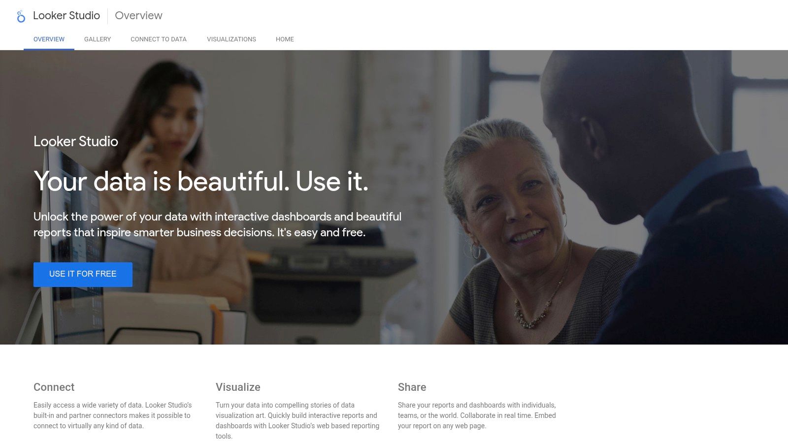
For a small business running paid search campaigns or focusing on SEO, Looker Studio offers a robust way to build a comprehensive dashboard without any subscription fees. The official Template Gallery provides a great starting point, allowing you to copy a pre-built report, connect your own data sources, and customize it to your needs. This makes it an excellent example of a marketing dashboard for anyone looking for a powerful, no-cost solution.
Key Features and User Experience
Looker Studio provides a blank canvas for building highly customized reports, giving users full control over the layout, design, and data visualizations. Key features include:
- Native Google Connectors: Effortlessly pull data from Google Analytics, Google Ads, Search Console, YouTube Analytics, and Google Sheets for free.
- Vibrant Template Gallery: Access a large collection of templates built by both Google and the community to kickstart your dashboard creation.
- Highly Customizable: Unlike some template-driven tools, you have complete freedom to drag and drop charts, tables, and scorecards anywhere on the page.
- Easy Collaboration and Sharing: Share reports with a link, embed them on a website, or schedule automated PDF exports to stakeholders.
Pros and Cons
Pros:
- Completely Free: There is no cost to use the platform, which is a massive advantage for small businesses and startups.
- Deep Google Integration: The best-in-class tool for visualizing data from Google's marketing and analytics products. Many templates, including these SEO dashboard examples, leverage this strength.
- Extensive Customization: Offers almost limitless control over the design and functionality of your dashboards.
Cons:
- Paid Third-Party Connectors: Connecting to non-Google data sources like Facebook Ads or HubSpot often requires purchasing a third-party connector, which can get costly.
- Steeper Learning Curve: The "blank canvas" approach can be intimidating for beginners compared to more guided platforms.
Pricing and Access
Google Looker Studio is free to use with a Google account. While the platform itself is free, be mindful that connecting to certain third-party data sources may incur costs from connector developers. An enterprise version, Looker Studio Pro, is also available for larger teams needing advanced governance and support features. You can get started at https://lookerstudio.google.com.
4. HubSpot (Reporting & Dashboards)
For businesses already operating within the HubSpot ecosystem, its native reporting and dashboards tool is often the most logical and efficient choice. Instead of connecting third-party tools, HubSpot allows marketers to build powerful dashboards using the data they already collect in the CRM, from form submissions and website visits to email opens and deal stages. This tight integration makes it a seamless example of a marketing dashboard solution for users who want a single source of truth.

The platform is designed to connect marketing activities directly to sales outcomes. By leveraging its template library, even non-technical users can quickly assemble dashboards that track the entire customer journey. You can start with a pre-built template for lead generation or website traffic and then customize it by dragging and dropping new reports onto the canvas, making data analysis accessible without a steep learning curve.
Key Features and User Experience
HubSpot's main advantage is its native data connection, which eliminates the setup headaches common with other tools. The user experience is clean and consistent with the rest of the HubSpot platform. Key features include:
- Native HubSpot Data Integration: Reports are built directly from your CRM, marketing, and sales data, providing instant, accurate attribution for contacts and deals.
- Report & Dashboard Library: Get started quickly with a collection of pre-made templates for common use cases like website analytics, lead generation, and sales performance.
- Drag-and-Drop Assembly: Customize your dashboards by easily adding, removing, and resizing individual reports on a flexible grid.
- Easy Sharing and Permissions: Share dashboards with your team, schedule recurring email updates, or integrate them with Slack to keep everyone informed.
Pros and Cons
Pros:
- Fastest Setup for HubSpot Users: If your marketing and sales data is in HubSpot, you can create a dashboard in minutes.
- Powerful Native Attribution: Includes built-in fields for tracking lead sources and campaign performance without extra configuration. If you want to understand which metrics matter most, you can learn more about key marketing metrics to track.
- Accessible for Non-Technical Users: The template library and intuitive interface lower the barrier to entry for creating insightful reports.
Cons:
- Tied to Paid Tiers: The most powerful and flexible reporting features are locked behind higher-priced Marketing Hub or Reporting Add-on plans.
- Limited External Data: Integrating and blending data from sources outside the HubSpot ecosystem often requires third-party connectors or custom solutions.
Pricing and Access
HubSpot's reporting tools are available across its various Hubs (Marketing, Sales, Service), with capabilities increasing significantly with each pricing tier. A free CRM plan offers basic dashboards, but custom reporting and advanced analytics are features of the Professional and Enterprise plans. You can explore the different tiers at https://www.hubspot.com/products/reporting-dashboards.
5. DashThis
DashThis is a reporting automation tool built specifically for marketers and agencies who need to create and share client-ready dashboards quickly. Its core value lies in its simplicity and focus on reporting, offering dozens of preset templates for common channels like GA4, Google Ads, Facebook Ads, and SEO. It streamlines the process of pulling data from multiple sources into a single, cohesive view.
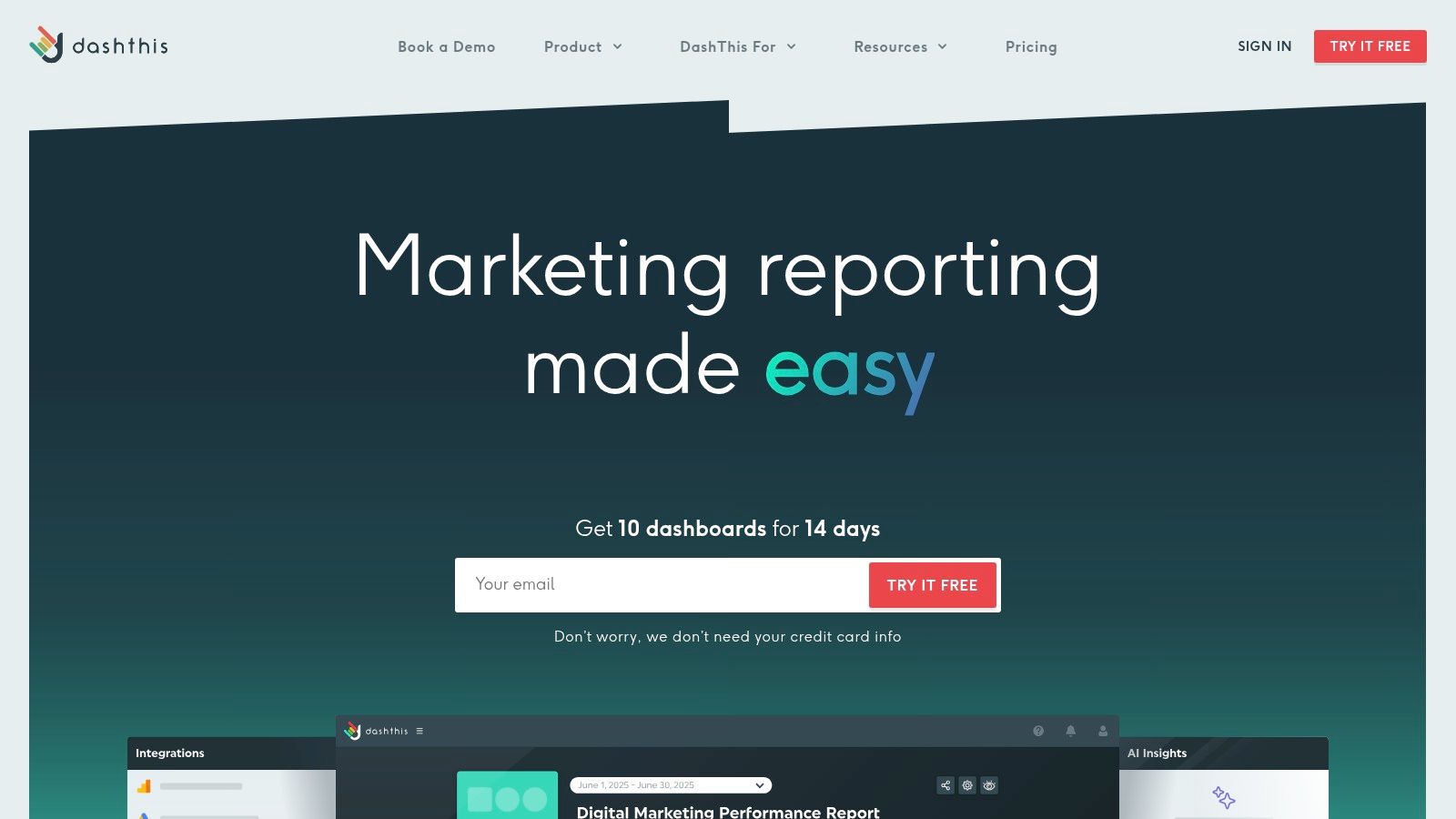
Unlike more complex BI tools, DashThis is designed for efficiency. Marketers can select a template, connect their integrations, and have an automated report ready to share in minutes. This makes it a perfect example of a marketing dashboard platform for agencies and consultants who manage multiple clients and need to deliver consistent, professional-looking reports without a heavy technical lift. The emphasis is on "done-for-you" reporting rather than deep, custom data exploration.
Key Features and User Experience
DashThis prioritizes a straightforward, user-friendly experience that helps marketers save time on reporting. The platform is clean and intuitive, making it easy to build and automate reports. Key features include:
- Preset Report Templates: Get started instantly with templates for SEO, PPC, social media, email marketing, and more.
- Automated Sharing: Schedule automated email dispatches of PDF reports to clients or stakeholders, ensuring everyone stays informed.
- Unlimited Integrations: All paid plans include unlimited data source connections, so you don't have to worry about hitting a cap as your marketing stack grows.
- AI-Powered Insights: An optional AI assistant can automatically generate summaries of performance, highlighting wins, issues, and opportunities directly within your dashboard.
Pros and Cons
Pros:
- Agency-Focused Features: White-labeling options and unlimited users make it ideal for agency workflows.
- Simple, All-Inclusive Pricing: Pricing is based on the number of dashboards, not users or integrations, which simplifies cost management.
- Excellent Ease of Use: The platform is incredibly easy to navigate, allowing for rapid report creation.
Cons:
- Limited Customization: It is less flexible than a full business intelligence tool, making complex data modeling or highly custom visualizations challenging.
- Dashboard-Based Pricing: The cost can escalate for teams that need to generate a large number of individual dashboards for different campaigns or reporting cadences.
Pricing and Access
DashThis offers plans based on the number of dashboards you need, starting with a plan for 3 dashboards. All plans include unlimited integrations, data sources, and users. They offer a 15-day free trial to test the full functionality. You can review their plans and get started at https://dashthis.com.
6. Klipfolio (PowerMetrics)
Klipfolio is a powerful business intelligence tool that finds a sweet spot between template-driven simplicity and deep customization. Its PowerMetrics product is designed for marketers who want to start with pre-built dashboards but need the flexibility to dig deeper as their skills and business needs grow. The platform features a "Klip Gallery" with hundreds of pre-built data visualizations and dashboard templates for tools like Google Analytics 4, HubSpot, and Salesforce.
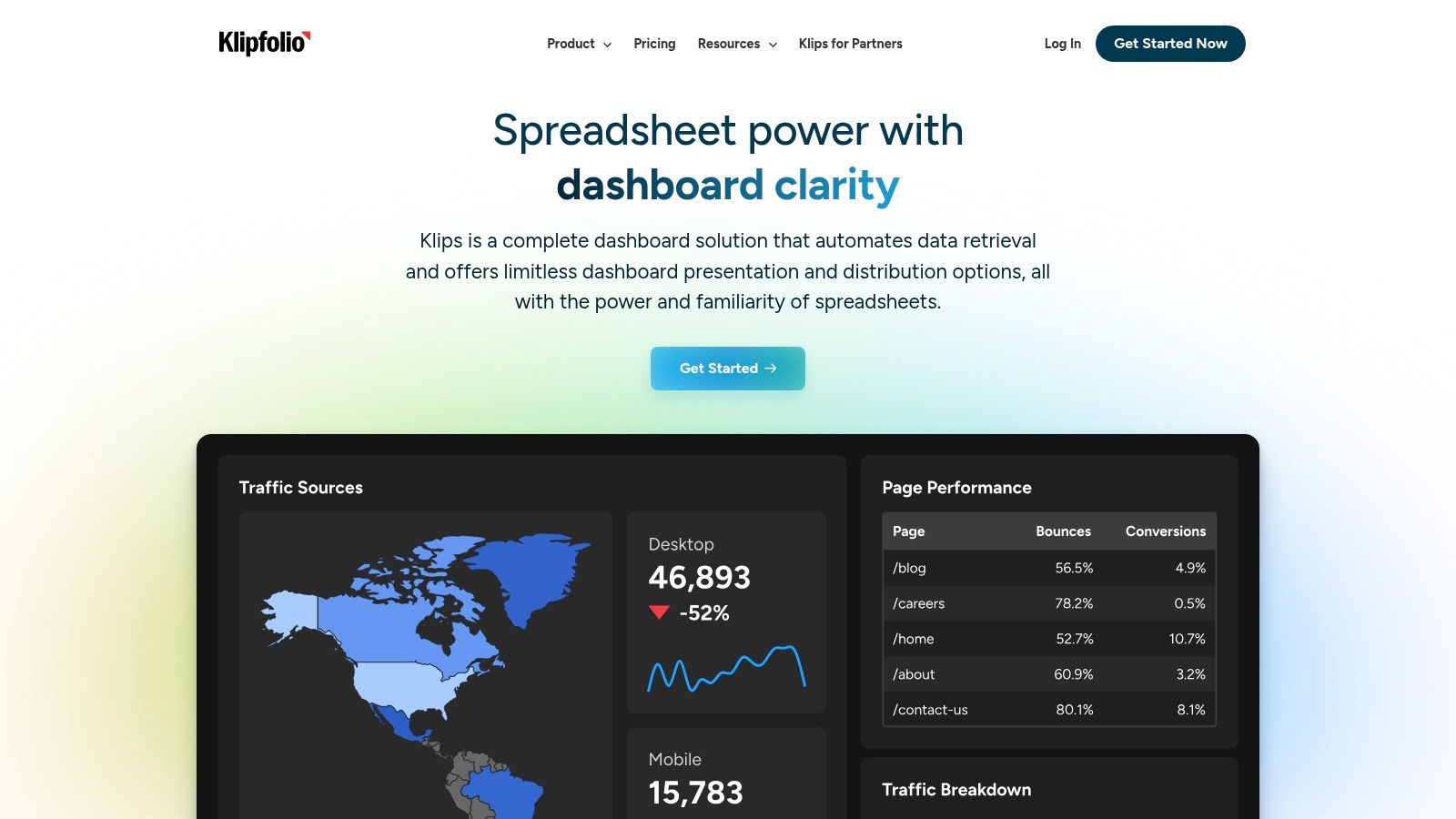
This balance makes Klipfolio a strong example of a marketing dashboard for growing teams. You can get started quickly with a template for Google Ads or social media performance, and later use the robust editor to build highly custom metrics and visualizations without being forced to switch platforms. It's a tool that can scale with you from your first dashboard to advanced business intelligence.
Key Features and User Experience
Klipfolio empowers users to not just view data, but to model and manipulate it. While it has a slightly steeper learning curve than pure plug-and-play tools, its interface is logical and well-supported with documentation. Key features include:
- 100+ Pre-built Dashboard Examples: The Klip Gallery provides a massive head start for visualizing data from over 130 integrated services.
- Metric-Centric Approach: Instead of just connecting raw data, you build a library of key metrics (like 'Leads' or 'Cost Per Acquisition') that can be reused across multiple dashboards.
- Advanced Customization: Users can write custom formulas, join different data sources, and control every aspect of a chart’s appearance.
- Agency-Focused Tools: Features like PDF exports, scheduled reporting, and white-labeling make it ideal for agencies managing client reports.
Pros and Cons
Pros:
- Highly Scalable: Starts simple with templates but offers deep customization for advanced analysis.
- Strong Data Modeling: The metric-centric approach helps maintain data consistency across all reports.
- Agency-Friendly: White-labeling and SSO are available on higher-tier plans, which is great for client management.
Cons:
- Steeper Learning Curve: Moving beyond templates requires more effort compared to simpler dashboard tools.
- Gated Support Content: Some detailed support articles and tutorials require you to sign in to view them.
Pricing and Access
Klipfolio PowerMetrics offers a free plan for one user that includes unlimited metrics and dashboards with some data freshness limitations. Paid plans start at a competitive price point and scale based on the number of users and advanced features like white-labeling. You can sign up and explore the Klip Gallery at https://www.klipfolio.com.
7. Geckoboard
Geckoboard is a dashboard tool that excels at making marketing data visible and easily understood for the entire team. Its primary strength lies in creating live, "always-on" dashboards that can be displayed on a large screen or TV, ensuring key metrics are constantly in sight. This focus on real-time visibility helps teams stay aligned and motivated by their performance data.
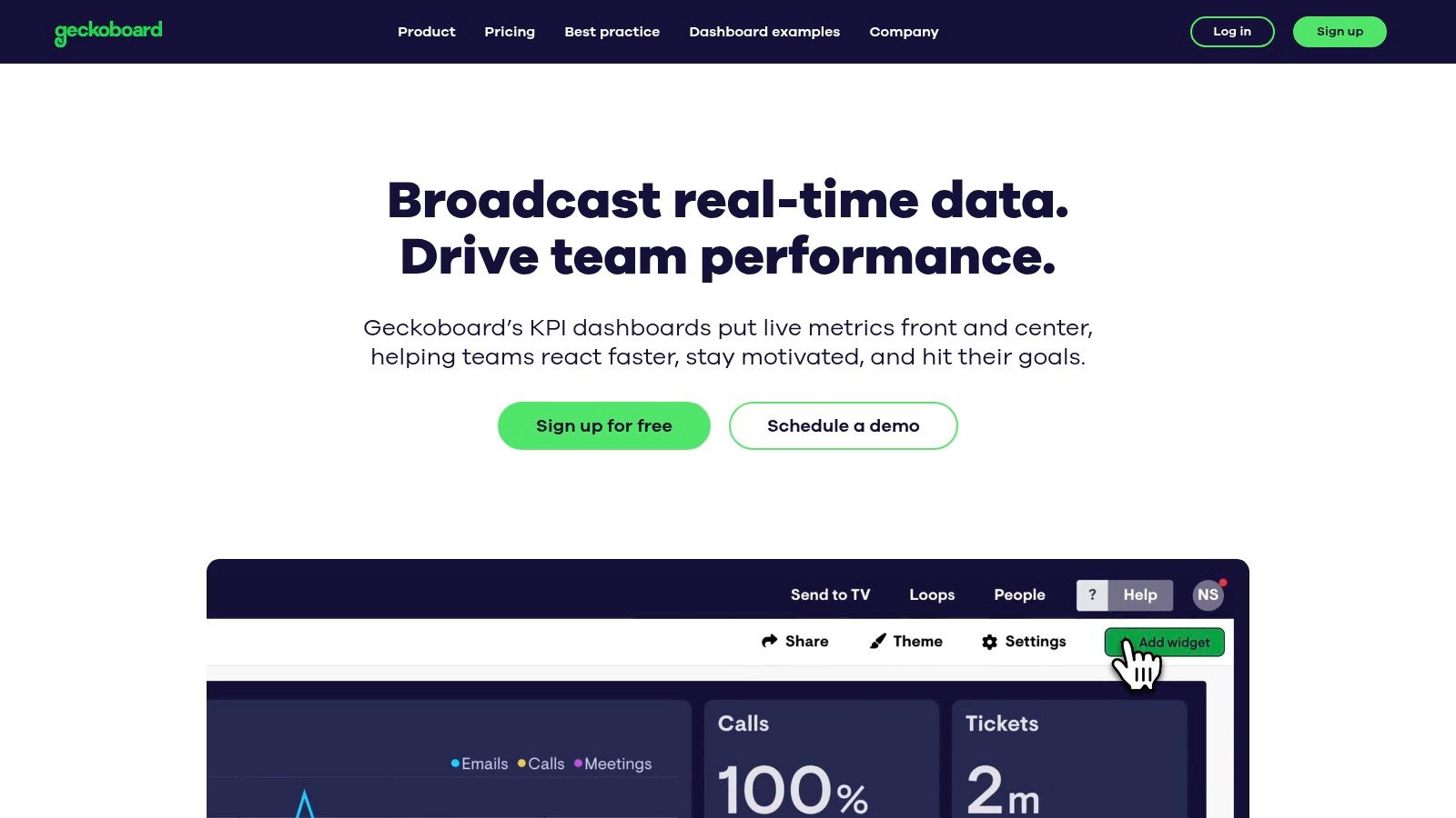
For a non-technical marketer or a small business owner who needs to keep their team focused on specific goals, Geckoboard provides an excellent example of a marketing dashboard solution. It strips away the complexity of deep data analysis and instead prioritizes clarity and immediate access to crucial KPIs. The platform is designed for quick setup and display, making it ideal for teams who value at-a-glance performance updates over intricate reports.
Key Features and User Experience
Geckoboard is all about simplicity and visual impact. The user interface is clean, intuitive, and built for users who want to create and share dashboards without any technical friction. Key features include:
- 90+ Pre-built Integrations: Connect to popular marketing platforms like Google Analytics, Google Ads, HubSpot, and social media channels with minimal effort.
- Easy Sharing and TV Display: Share dashboards with a link, via Slack, or set them up to loop on an office TV. This "set and display" functionality is a core part of its appeal.
- Curated Dashboard Examples: Get started quickly with a library of ready-made examples for lead generation, SEO, digital marketing, and more.
Pros and Cons
Pros:
- Exceptional for Real-Time Visibility: Perfect for creating visual, team-facing dashboards to display in an office.
- Very Easy to Use: The clean user experience is designed for non-technical users to get started quickly.
- Fast Setup: Go from data connection to a live dashboard in just a few minutes.
Cons:
- Limited Deep Analysis: Less suited for complex data modeling or in-depth performance analysis compared to more robust BI tools.
- Plan-Based Limitations: The number of dashboards, users, and editors is restricted by the pricing tier.
Pricing and Access
Geckoboard offers a free plan to get started, which includes one dashboard and spreadsheet integration. Paid plans scale based on the number of dashboards and users you need. You can see their full pricing and sign up at https://www.geckoboard.com.
7-Tool Marketing Dashboard Comparison
| Product | Implementation Complexity 🔄 | Resource Requirements ⚡ | Expected Outcomes 📊 | Ideal Use Cases 💡 | Key Advantages ⭐ |
|---|---|---|---|---|---|
| LeadPulse | Very low — one-line script, set-and-forget | Minimal dev time; free tier limited, paid for higher volumes | Accurate lead attribution preserved across pages; CRM-level source data | Non-technical marketers, SMBs, agencies using forms + CRM | Preserves UTMs; direct CRM push; fast setup |
| Databox | Low — copy template and connect data sources | Moderate — connects 130+ sources; costs rise with sources used | Fast visual dashboards and performance summaries for clients | Agencies and SMBs needing multi-client reporting | Large template gallery; many connectors; sharing/embed ready |
| Google Looker Studio | Low–medium — templates easy, some connector setup needed | Low cost (free); may require paid third-party connectors for non-Google data | Flexible, customizable reports for Google-native data | Teams using GA4/Google Ads/Search Console natively | Free; deep Google integrations; big community template ecosystem |
| HubSpot (Reporting & Dashboards) | Low if native HubSpot data; medium for cross-stack setups | Requires HubSpot subscription for advanced features | Integrated marketing & sales reports with native attribution | Organizations already on HubSpot CRM/Marketing Hub | Native data, drag-and-drop reports, team permissions |
| DashThis | Low — preset templates and automated refresh | Moderate — pricing by dashboard count; unlimited integrations | Packaged, client-ready reports with automated exports | Agencies/consultants needing turnkey client dashboards | White-labeling, automated exports, agency-focused pricing |
| Klipfolio (PowerMetrics) | Medium — templates plus deeper customization | Moderate — 130+ integrations; steeper setup for complex builds | Scalable dashboards that transition to richer BI use cases | Teams growing toward custom BI and advanced dashboards | Strong template + customization balance; agency features (SSO, white-label) |
| Geckoboard | Very low — quick to stand up live dashboards | Low — focused integrations; tier limits on dashboards/users | Real-time KPI visibility for teams and TV displays | Teams wanting always-on KPI displays (war rooms, TVs) | Polished UX; fast deployment; ideal for live displays |
From Data to Decisions: Your Next Steps
We've explored a powerful collection of marketing dashboard examples, from the laser-focused lead attribution views in LeadPulse to the comprehensive, all-in-one reports you can build with tools like Databox and Google Looker Studio. The journey through these examples reveals a central truth: a great marketing dashboard is more than just a collection of charts. It’s a strategic command center that transforms raw data into clear, actionable decisions.
The goal is no longer to simply collect data, but to connect it. As we saw, the most effective dashboards tell a story, linking top-of-funnel activities like ad clicks and blog visits directly to bottom-of-funnel results like form submissions and closed deals. This is the clarity every non-technical marketer and small business owner deserves.
Key Takeaways for Building Your Dashboard
As you move forward, keep these core principles in mind. They are the difference between a dashboard that looks nice and one that drives real growth.
- Start with Your Questions: Don't begin by asking "What metrics can I track?" Instead, ask "What questions do I need to answer?" For example, "Which marketing channel is bringing me the most qualified leads?" This approach ensures every KPI on your dashboard serves a specific purpose.
- Focus on Attribution: The most common frustration is not knowing where leads come from. Prioritize connecting form submissions to their original marketing source. This single insight can completely reshape your budget and strategy.
- Simplicity is Your Superpower: You don't need dozens of complex charts. As our examples demonstrated, a handful of well-chosen KPIs, like Cost Per Lead, Lead-to-Customer Rate by Channel, and Top Converting Pages, provides more value than a cluttered, overwhelming report.
Choosing the Right Tool for Your Business
The "best" tool is the one that fits your specific needs and technical comfort level. Here’s a quick guide to help you choose:
- If your primary goal is lead attribution: Start with a specialized tool like LeadPulse. It’s designed to solve the exact problem of capturing UTM data from forms and sending it to your CRM without any code.
- If you need a free, powerful, and customizable solution: Google Looker Studio is an excellent choice, especially if you're comfortable connecting different data sources. It has a steeper learning curve but offers incredible flexibility.
- If you want an easy-to-use, all-in-one reporting tool: Consider Databox, DashThis, or Geckoboard. These platforms excel at pulling data from many sources into beautiful, pre-built templates, making them perfect for busy teams.
- If you're already invested in a specific ecosystem: Leverage the native reporting tools you already have, like HubSpot's Dashboards. Keeping your data and reporting in one place can simplify your workflow significantly.
Ultimately, the most powerful example of a marketing dashboard is the one you build, use, and act on consistently. Start small, focus on your most critical business questions, and build momentum from there. The clarity you gain will not only prove the value of your marketing efforts but also illuminate the direct path to sustainable growth.
Tired of seeing "(not set)" in your CRM? If you're ready to build a marketing dashboard that actually shows you where your leads come from, LeadPulse is the missing piece. It automatically captures UTM and attribution data from your forms and sends it straight to your CRM, no code required. Get the clarity you need with LeadPulse.
Unlock the Power of b2b marketing attribution for ROI
Explore how b2b marketing attribution works, track leads from first click to sale, compare models, and prove your marketing ROI.
7 High-Converting Lead Generation Form Examples for 2026
Discover 7 powerful lead generation form examples. Learn from the best B2B demo, newsletter, and contact forms to boost your conversion rates today.